
A Location-Based
Website for Shopping
Small Locally
If you’ve already read the below introduction and initial research to the Local app, click here to skip ahead to the Local website-specific project content.
—
Small, locally-owned shops almost never list their current inventory online, but instead are limited to listing basic information like store hours and location. They don't have the resources to develop websites and apps that can compete with those of large corporations.
If a shopper wanted to compare products and pricing between the big online vendors and that of small businesses in their neighborhood, they would have to physically go visit each store – a prospect that is so time-consuming as to never be considered by the average consumer.
How can the consumer make informed comparisons between what's in stock at nearby businesses and what can be ordered online?
Goals
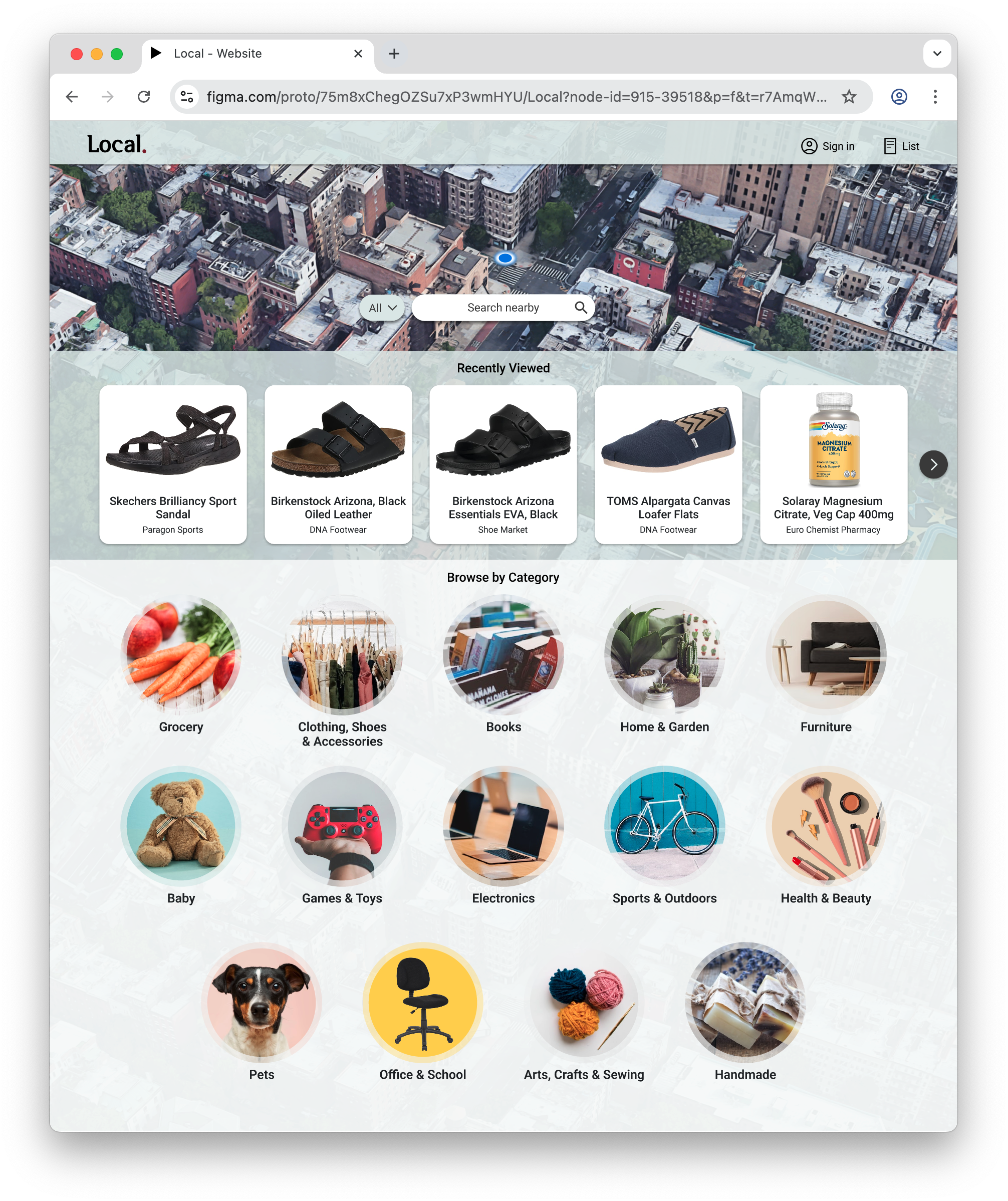
Design a single website that local small businesses can together use to display their inventory, allowing customers to easily browse items available at a variety of smaller stores nearby before visiting in person to make a purchase.
Empower small businesses to better compete with large corporations and enable the consumer to make informed shopping decisions between products available locally and online.
Client: Student project for Google's UX Design Certificate Program
Sectors: Commerce, Navigation
My Role: Entire product design – research, conception, prototyping and testing
Project Time: 2 months
I wanted to understand the habits and typical circumstances of consumers who shop at local small businesses and how a new shopping platform might improve their experience.
I started by conducting 5 interviews. Several pain points immediately stood out.
Research
-
Many local small businesses have websites with information about the business, but not about the products and pricing of their inventory.
-
Visiting many stores to compare prices is time-consuming and unrealistic, but my interviews showed that participants wanted to be able to make informed decisions.
-
Participants wanted to be confident an item was in stock before taking the time to visit the store in person.
-
Especially for participants in urban areas, there are simply too many stores to visit in order to be aware of what specific products they offer.
I used what I discovered during the interviews to create user personas and a user journey map. This allowed me to identify additional opportunities to improve shoppers' experiences before exploring a variety of concepts in paper wireframes.


Paper Wireframes – Homepage
I explored different layouts for arranging a search field, a categories grid, and an ideas carousel on the home page.
I wanted a hero image showing the user’s specific neighborhood as the backdrop for a search field overlay in order to show their own unique neighborhood, setting their experience apart from the more generic big-box store shopping experiences right from the outset.
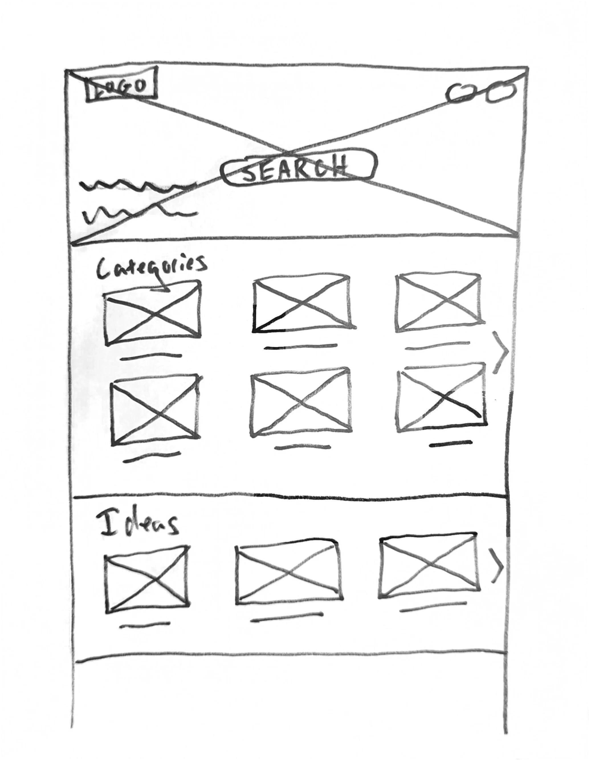
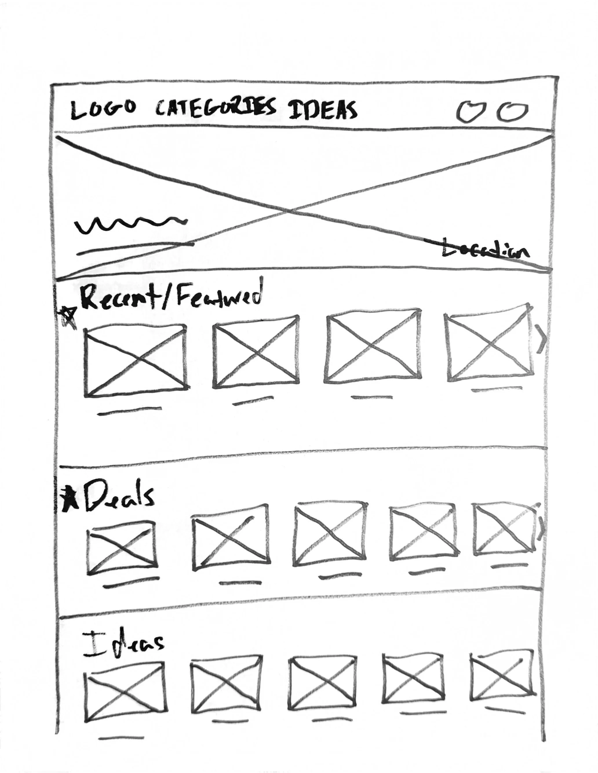
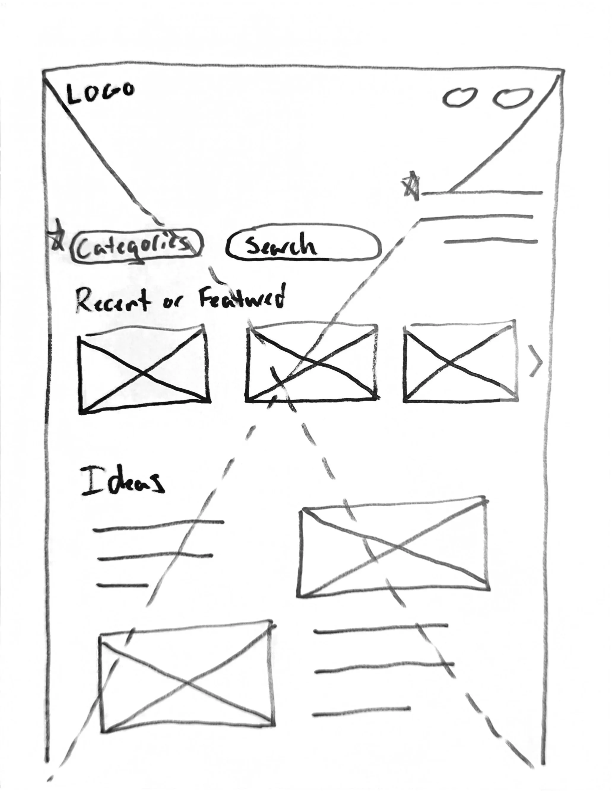
This is the final drawing for the homepage, which I used to create the first of the low-fidelity wireframes.
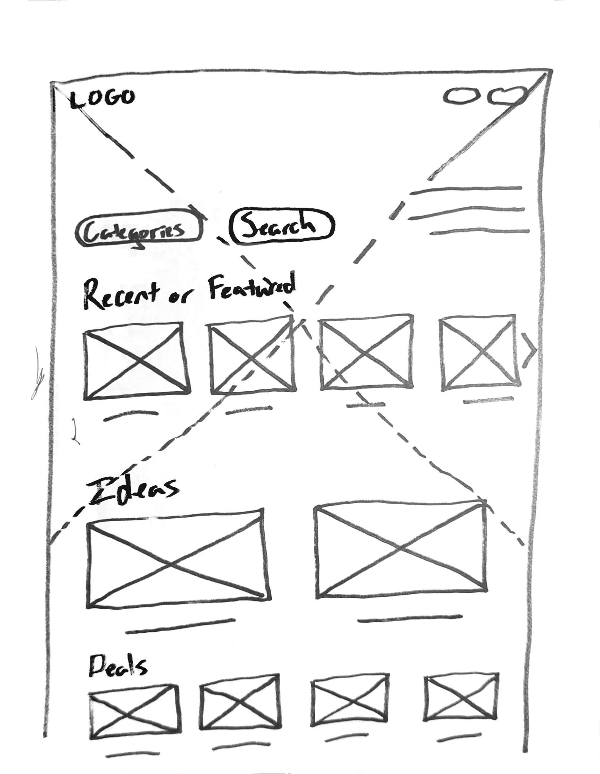
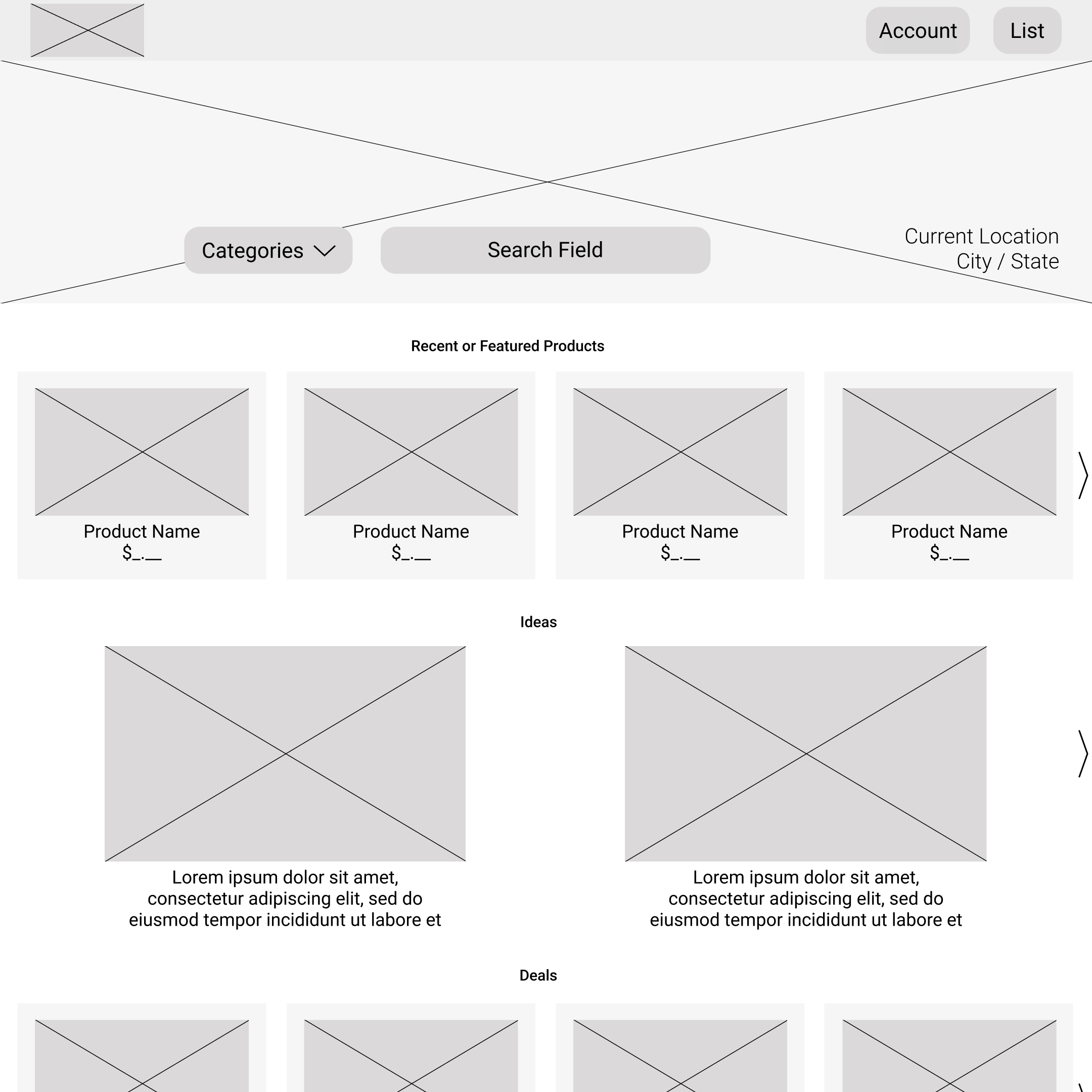
Low-Fidelity Prototypes
-
![]()
Home
I designed this page to be the launching point for shopping by means of entering an item into the search field, browsing ideas (for gifts, dinner, etc), or checking out the deals section for items on sale.
I wanted the image of the neighborhood (top), along with the user’s current location to set the context for the entire shopping experience right from the start.
-
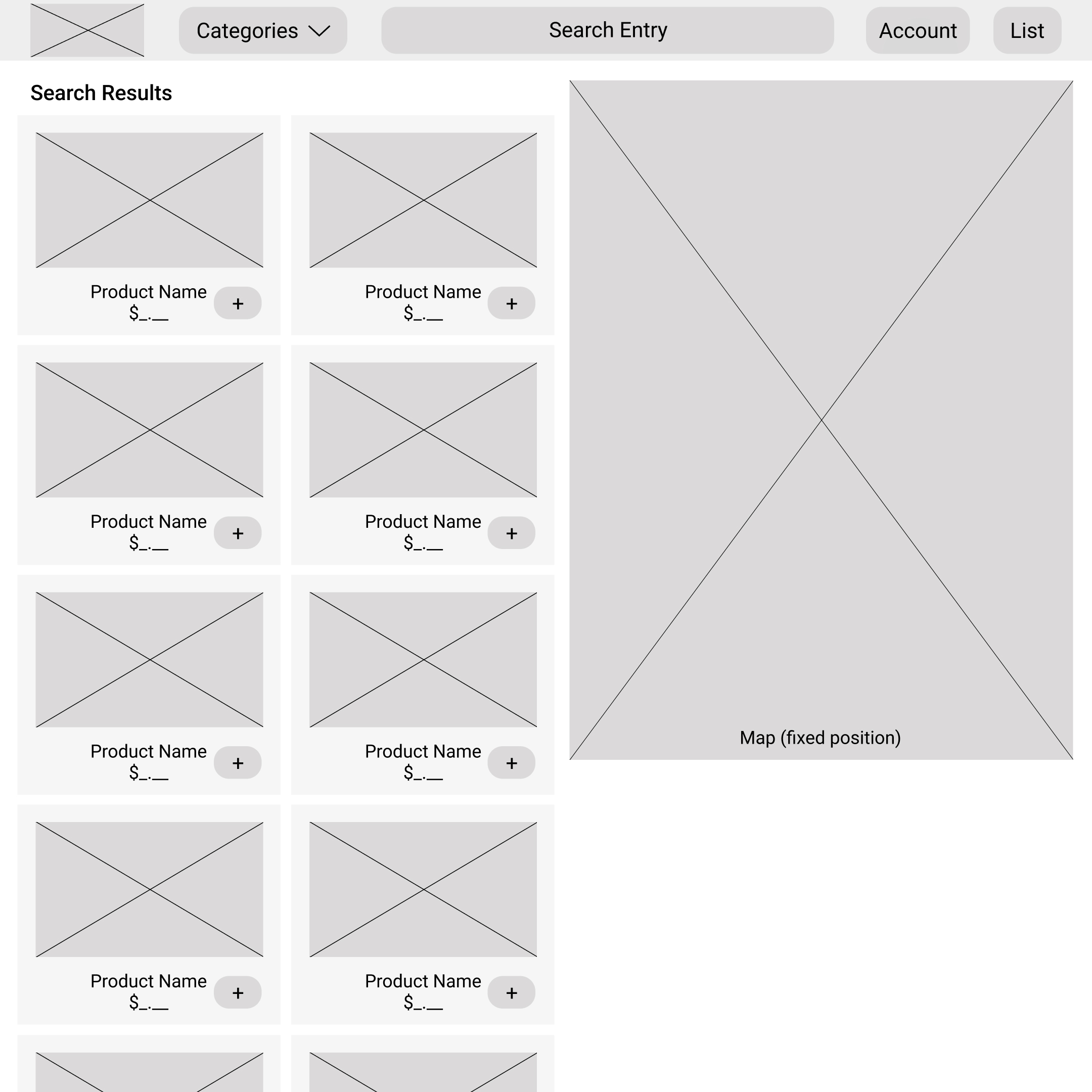
![]()
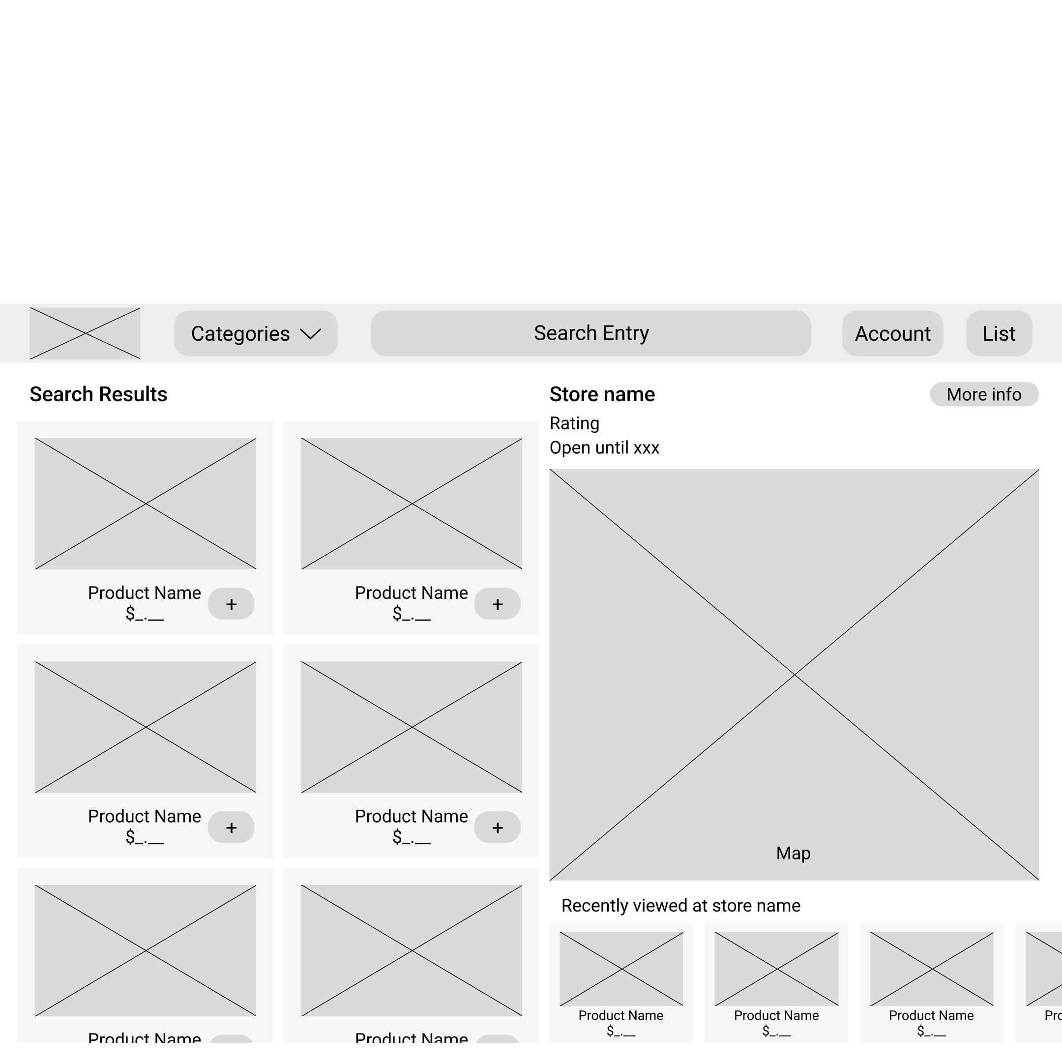
Search Results
I designed this page to be as informative as possible for easily comparing items at a variety of nearby stores – including a consideration of the route and time required for users to pick up each item.
How it works: The map (right) is fixed on the screen, while the user scrolls the search results (left). Hovering over each result instantly displays the route to the store carrying the product.
-
![]()
Product Description
I designed the product description as an overlay above the search results, rather than a new page. I wanted to encourage the user to feel free to take closer looks at items by assuring them in a visual way that the search results (including their last scroll position) were still there behind the overlay just as they left them.
-
![]()
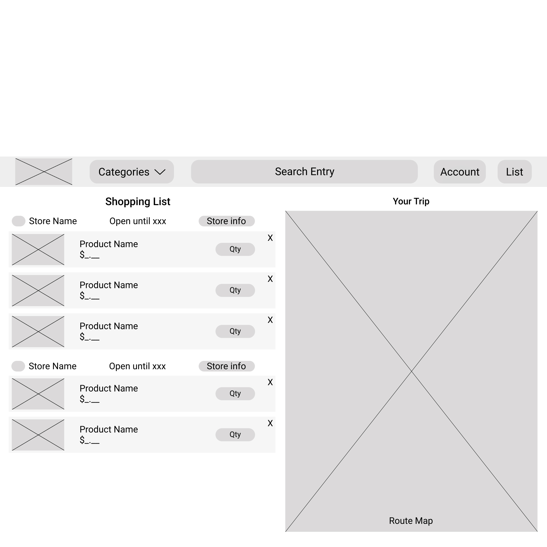
Shopping List
The shopping list is designed to remind the user what they’re planning to purchase at each store, as well as to summarize and provide a route for their shopping trip on the map (right).
“Open until” hours for the current day are provided for quick reference.
-
![]()
Search Results - Within a Store
If a user identifies a store that carries all or most of the products they’re looking to purchase and they want to reduce the number of stops they make, I wanted it to be easy for them to search the inventory of a single store before adding items to their shopping list.
If they had previously been viewing other items at the same store before honing in on that one store, they would appear in the recently viewed carousel below the map for easily retracing their browsing history and adding items to list.

Testing – Usability Study Round 1
I tested my prototype with 5 usability study participants and created an affinity diagram to help synthesize their pain points and other feedback. Below are four of the issues and suggestions for improvement that I saw frequently come up for participants.
1
2
Users assumed the “from the manufacturer” section was advertising, and therefore wanted it removed.
40% of users
4
Some other features that users wanted added included reviews in product descriptions, multiple modes of transportation available for routing / maps, and a “save for later” option for items.
I then worked to address these issues as I added fidelity to the designs.
3
Users unanimously liked the use of overlays for product descriptions as a way of staying more closely connected to the unchanged search results while looking closer at a product.
80% of users
Users had a strong negative reaction to the “ideas” carousel, associating it with underhanded product pushes and advertising.
80% of users
High Fidelity Prototypes
-
![]()
Home
I went the more experimental route on the homepage by using angled satellite imagery from Google Maps to place the “search nearby” overlay in the neighborhood visually, heavily contrasting the UI with that of Amazon and others’ more corporate, invariable look with no sense of place.
I took this approach because users I interviewed wanted to shop locally in large part due to their love of the unique landscape of their individual neighborhoods. I wanted their shopping experience to accompany that love of neighborhood, rather than operate removed from it.
In this iteration, I took out the “ideas” carousel based on feedback.
-
![]()
Search Results
I kept the color scheme simple on the basis of the feedback I received designing the app version. I also added a button to change between modes of transportation on the map, along with zoom functions.
How it works: The map (right) is fixed on the screen, while the user scrolls the search results (left). Hovering over each result instantly displays the route to the store carrying the product.
-
![]()
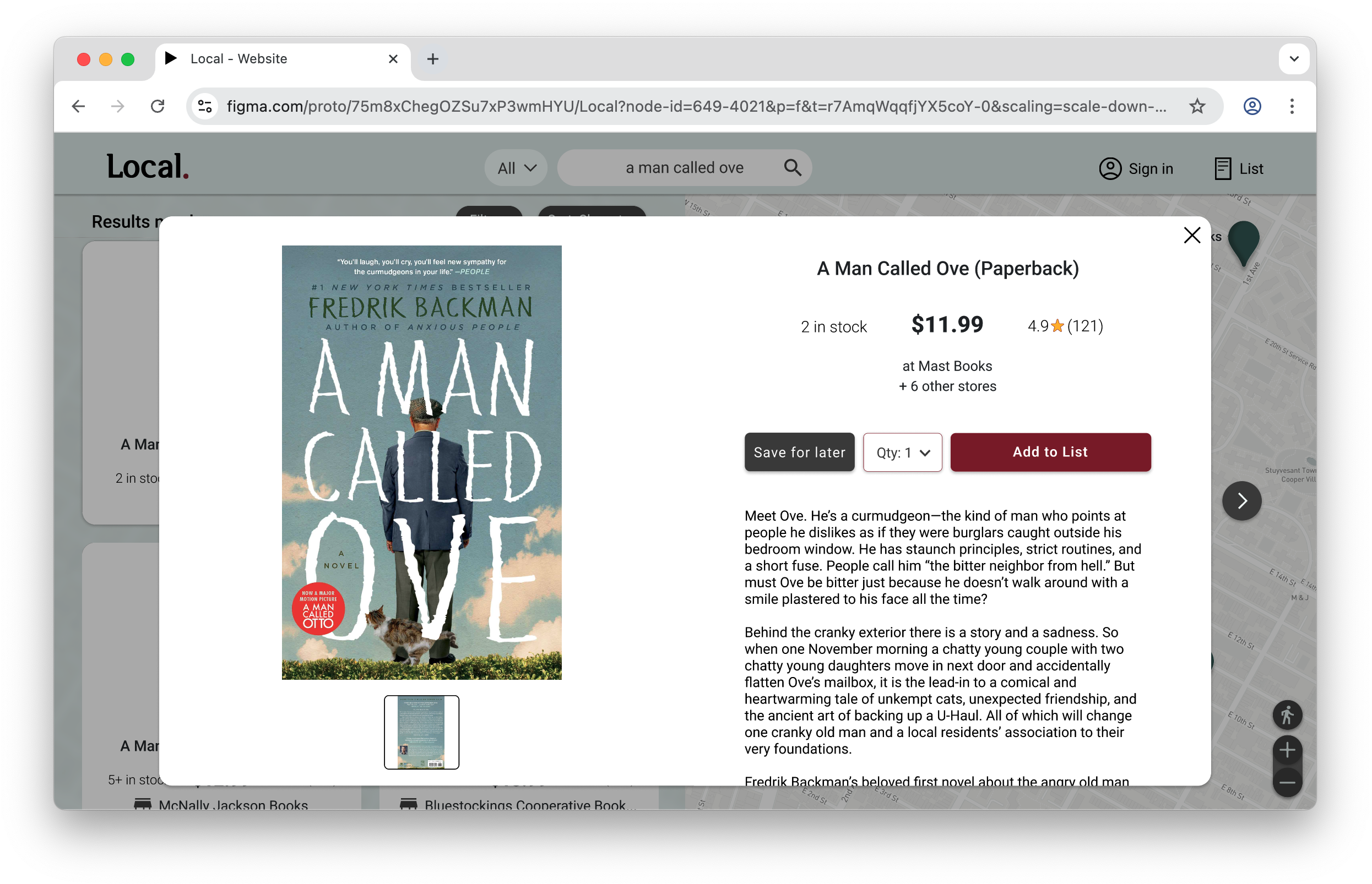
Product Description
The overlay product description proved popular with study participants, so I kept it. I then added a “save for later” button and product reviews that some users requested.
Though the “from the manufacturer” section was intended to simply be the manufacturer-supplied product description, users reacted negatively to it, assuming it was strongly advertising-bent. I knew users would still need product descriptions (not simply photos with no text), however, and so I simply removed the label from the section.
-
![]()
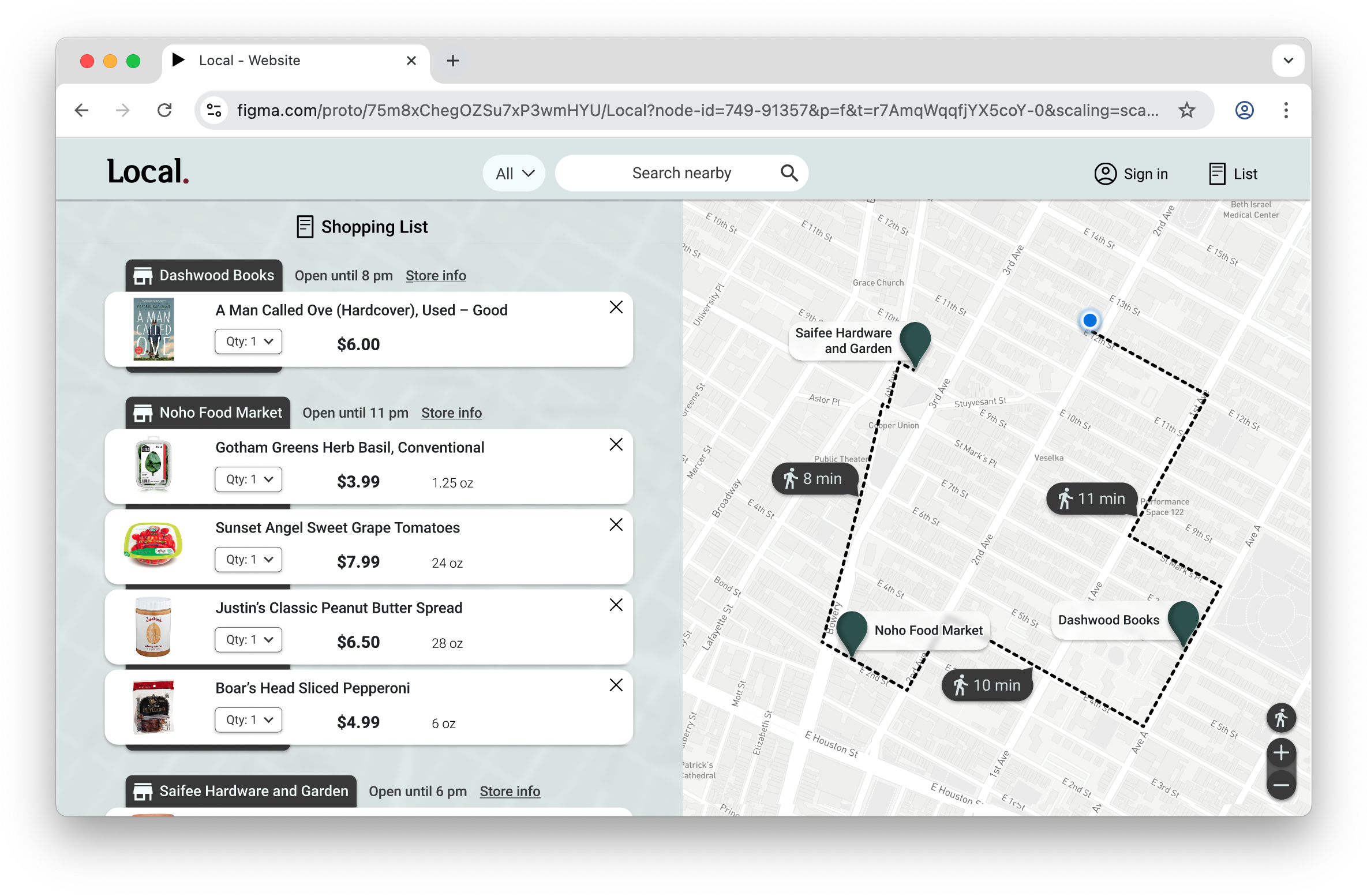
Shopping List
I took a bit of inspiration from the tops of file folders when arranging the shopping list items by store. I used the high contrast background element for the store names to add visual depth to the shopping list, and as a way to clearly indicate which store each item “belongs” to.
The map shows the route for the entire shopping trip, updating if the order of the stops were to be rearranged in the list.
-
![]()
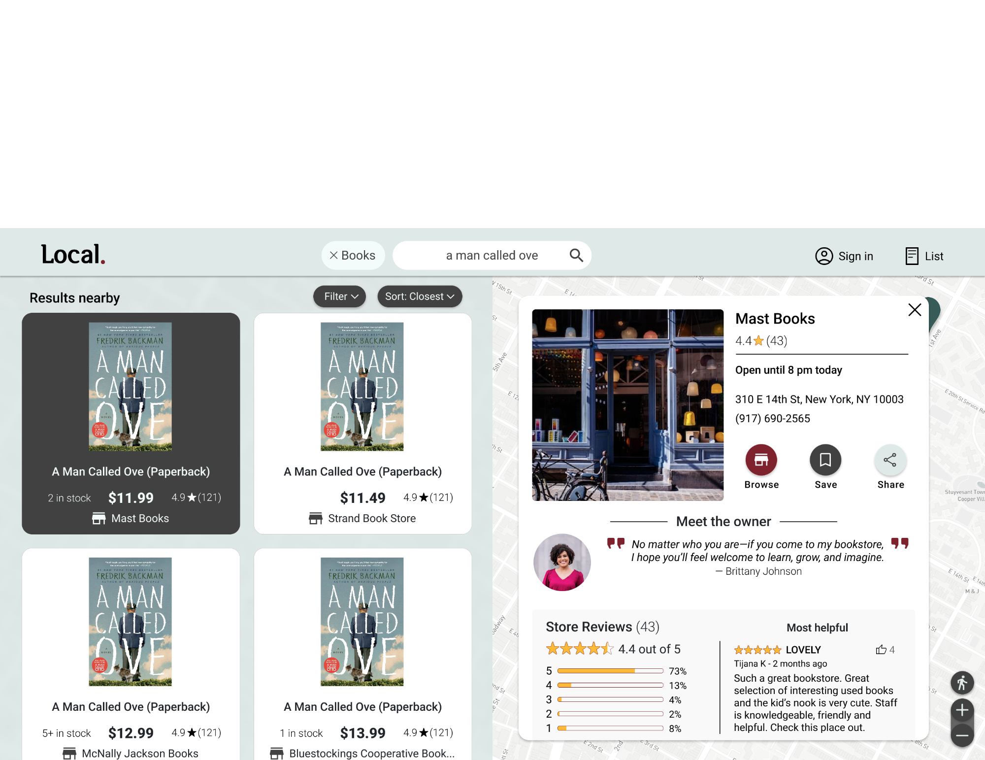
Store Page
After a study participant’s suggestion, I also created a store page with reviews and a “meet the owner” section to spotlight the uniqueness of small businesses with a more personal and neighborly vibe.


1
Participants thought that the recently viewed section looked too large and/or should be less prominent on the home page.
60% of users
High Fidelity Prototypes – 2nd Iteration
User flow: On the home page, the user begins shopping by A) typing into the search field (with optional categories to narrow results), B) selecting a recently viewed item from the carousel, or C) simply browsing items by category.
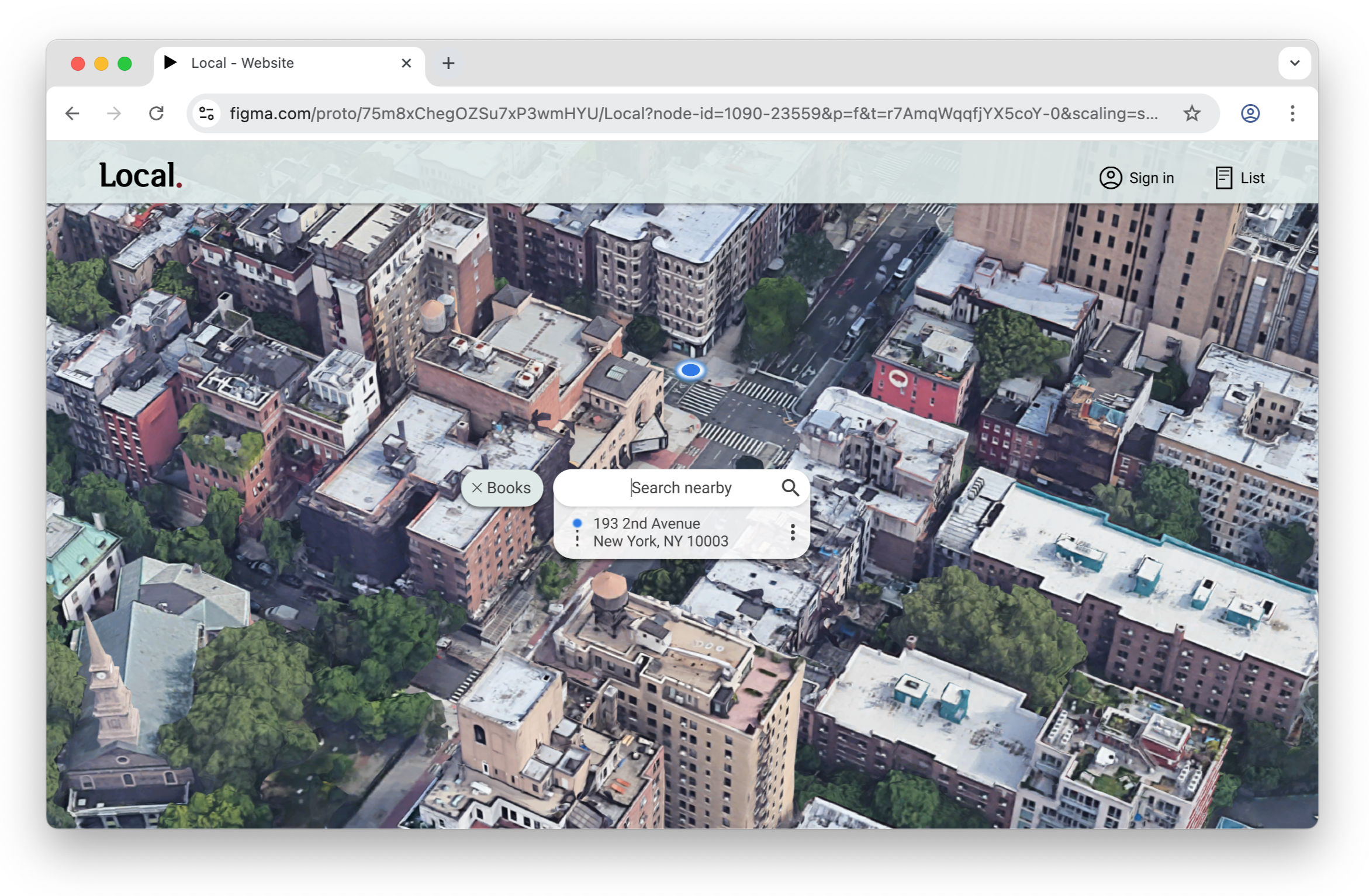
The satellite imagery in the hero space updates based on a user’s current location in order to convey to the user that they’re searching within their actual neighborhood—not some warehouse a hundred miles away.
I reduced the vertical space taken up by the recently viewed section, because users said it seemed to take over the search function, which needed to stand out more.
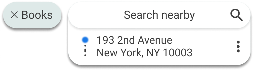
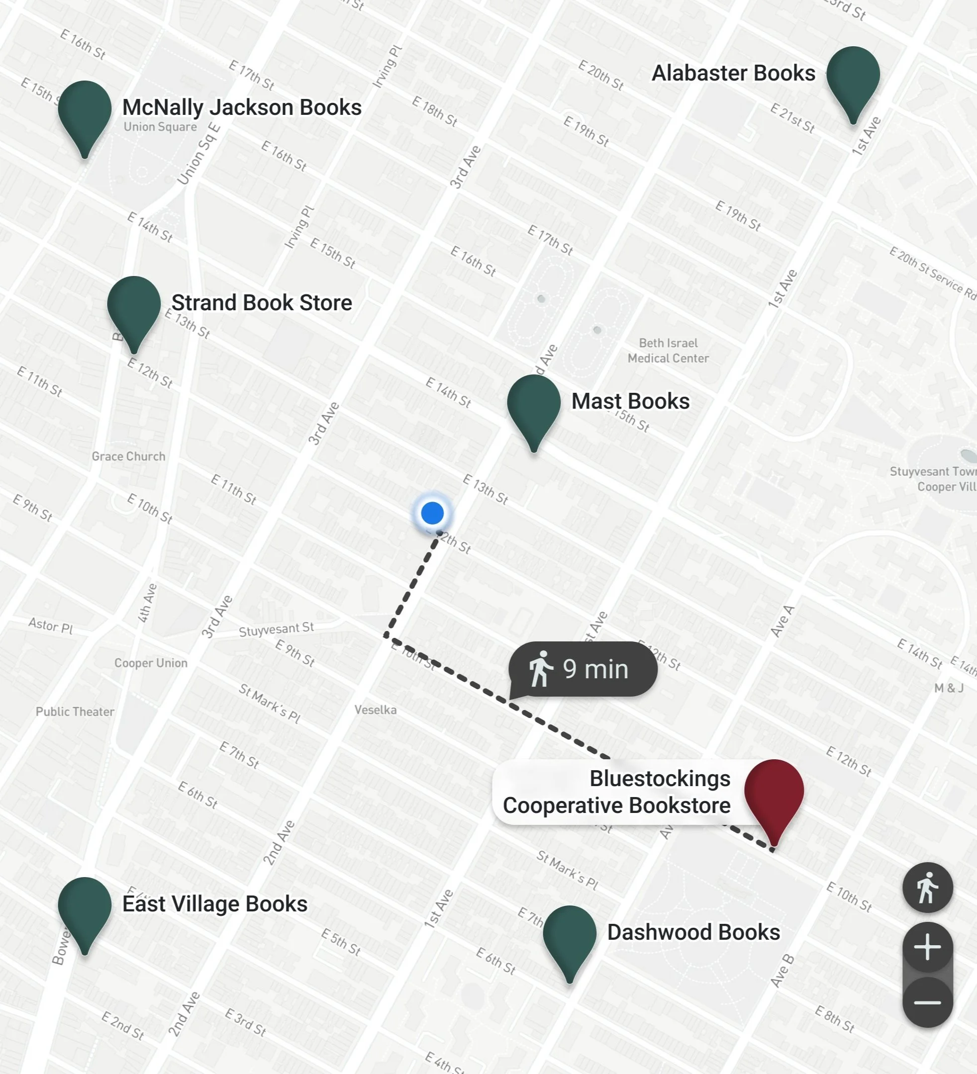
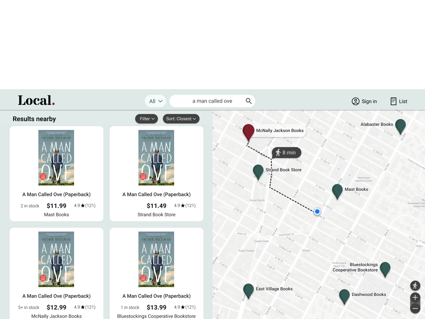
Search
How it works: In the search results, hovering over a result instantly displays the relevant route information, showing the user where the item is and the travel required for them to go and purchase it. In this image, the book from McNally Jackson is hovered over.
2
Search function lacks focus and needs more breathing room.
60% of users
Product Description
Study participants indicated that supporting local small business owners was a strong motivation for shopping locally, so I included a “meet the owner” section to put a name and face behind stores.
3
Users would like to be able to click on the map pin for store details.
40% of users
Home
Once the user clicks the search field at the top of the home page, the recently-viewed and categories sections are swept away, and searching becomes the central focus with more breathing room, per user feedback.
Testing – Usability Study Round 2
4
Nav bar, search results, and shopping list are too similar to each other and plain-looking.
40% of users
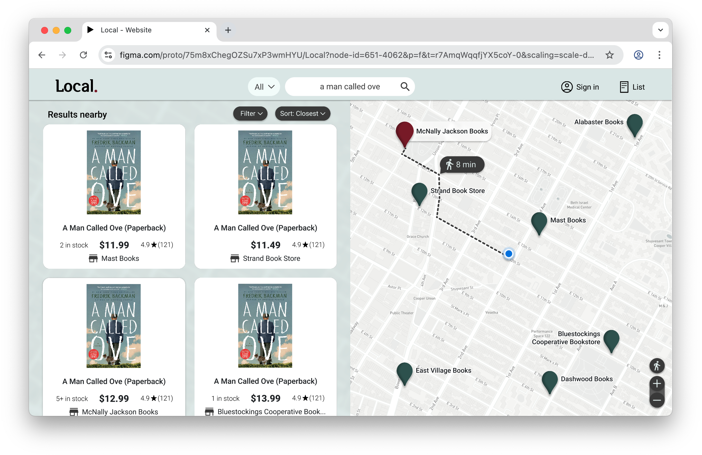
Users can now adjust the route and travel times based on other means of transportation.
Store Description

As requested, users can now click the store pins for store information.
Clicking a search result opens the product description. I used an overlay to assure to the user that their search results along with any search filters will remain unchanged when they return to them. An arrow button beside the overlay allows the user to carousel through the search results if they choose.

After adding products from different nearby stores, the shopping list page organizes everything they’ve added in a list format as well as a shopping route. Re-ordering the stores in the list will automatically update the mapped route.
Some users commented that the background of the shopping list and search results was flat and plain-looking. I modified the background to give it some transparency with a continuation of the map behind it.
The user searches for items nearby, with the options to narrow by category or to change the desired location of the search results before running the search.
Search Results
My goal was to lay out the search results in a way that empowers the user to consider the purchase options in their neighborhood with all the relevant information at hand.
Shopping List
Accessibility Considerations
1
2
Animations are timed between 150 and 500 milliseconds.
This follows the World Wide Web Consortium recommendations for accessibility.
Business Impact and Future Development
While it was primarily consumers that I designed Local for, small businesses also certainly stand to benefit. For businesses, the app provides a more viable user experience to compete with the ease of online shopping offered by the big box stores. Below are some thoughts for further developing the site in the future:
Inventory Management for Businesses
I think one of the big hurdles for small businesses using Local would be inventory management. How can a small business keep inventory (products offered, but also quantity of stock)
current, so that users could have confidence in the information they were seeing? A shopping site with unreliable information wouldn’t be useful to anyone.
In the future, I’d love to design an app for utilizing AI-driven visual search tools like Google Lens that business owners could use to quickly scan shelves periodically throughout the day to generate real-time stock #’s and pricing to be loaded into the backend of Local for consumers. The capability for scanning bar codes has been around for ages, and I think the ability for an app that uses Google Lens-type tech to additionally determine things like the number of items on a shelf and whether a sale sticker or sale sign is present is certainly attainable today.
Lists with Location-Based Suggestions
One potential feature that came up in a user interview had to do with location-based notifications. The idea is that a user could add items they need to an additional shopping list of items they don’t need urgently. Then when the app determines the user is a short distance from a store carrying the item, they are reminded to pick it up, if convenient. Users could also choose to be notified specifically when an item is on sale nearby, if it’s a deal they are holding out for. This could be a great feature for items users need to pick up eventually, but not necessarily on their next shopping trip.
3
Site is accessible to screen readers.
I used headings with different sized text for clear visual hierarchy.
Color contrast throughout the app meets Web Content Accessibility Guidelines.
Additionally, anywhere a color indicates a function, accompanying symbols or text do, too.