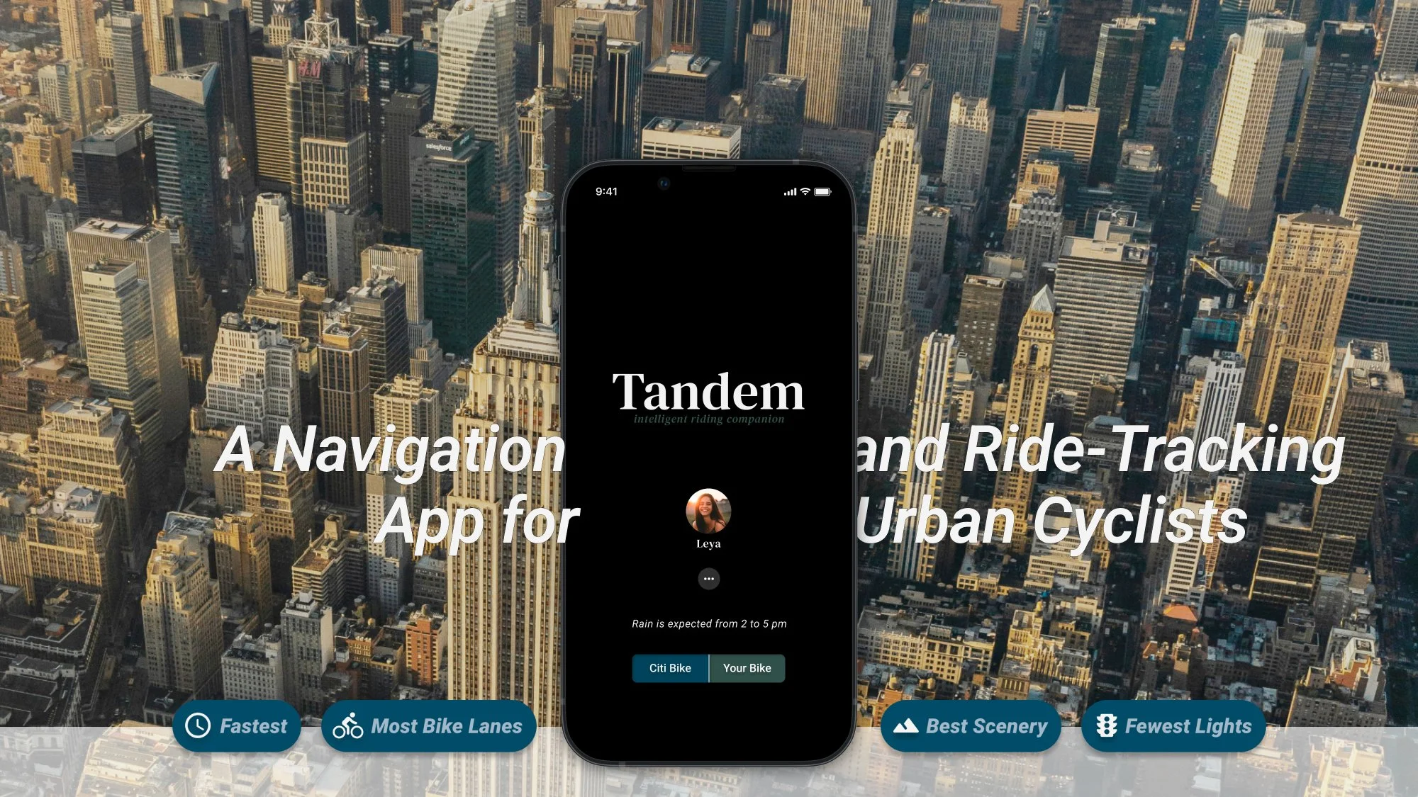
Client: Student project for Udacity's UX Design program
Sectors: Navigation, Health and Fitness
My Role: Entire product design – research, conception, prototyping and testing
Project Time: 3 months
Research & Analysis
In urban areas across the United States, the number of residents cycling as a means of transportation, fitness, and leisure is skyrocketing. In New York City, daily cycling has increased by 64% between 2013 and 2023. 762,000 adults in NYC ride a bike regularly, contributing to over 226 million completed bike trips in 2023 alone, according to the NYC Department of Transportation.
Navigating a large city’s network of streets is no simple task. Of the three most common navigation apps for driving, only one of them offers directions specifically for cyclists: Google Maps. And the features of this app remain primarily focused on drivers, rather than the unique needs of urban cyclists.
Goal
Design a navigation app that focuses solely on the unique needs of urban cyclists.
I suspected there was significant opportunity for improving the experience of cyclists navigating city streets. In order to define the problems I would be solving for in a new app, I recruited and interviewed 5 cyclists, allowing them to guide me through their process of completing a recent bike trip. What I discovered was a wealth of opportunities and overall discontent with currently available apps.
Interviews
What I wanted to learn from the interviews was how cyclists went about planning and completing a bike trip and what pain points they experienced along the way. I limited the scope of the interview questions to a single recent bike trip that had been along a route unfamiliar to the cyclist.
After completing the interviews, I used affinity mapping to find patterns in what the cyclists had shared.
Some key insights emerged regarding what was working for cyclists and what wasn't.
I brainstormed solutions and came up with 18 opportunities for entirely new app features or enhanced features from existing apps that would address the issues cyclists identified. I then arranged the potential solutions in a value vs. complexity quadrant to visualize which features had the best balance of lower complexity for developers and highest value for users. This allowed me to limit the scope of the project to solutions that had the highest potential return on investment.
Three solutions (in blue) emerged as frontrunners and would address the key insights I had identified. I then chose to design the app prioritizing these three solutions. I chose to design:
-
Integrate tracking and navigation by offering option to post rides on user’s preferred platform (Strava, social media, etc) after reaching destination.
-
When displaying suggested bike routes, the percentage of the route consisting of bike lanes should be noted for each, along with visual representations of where exactly the bike lanes are along each route map.
-
Offer option to prioritize suggested routes based on other preferences such as greater bike lane utilization or fewest traffic lights.
Follow-Up Survey Study — Preferences for Route Prioritization
Following the interviews, I was particularly interested in learning more about cyclists’ desire to set specific preferences for bike routes. In order to learn more about this key insight, as well as to validate the interview findings in a larger population, I conducted a follow-up survey study.
I asked participants to rate on a scale of 1-10 how important a variety of specific bike route characteristics were to them, with 10 indicating “extremely important to me.” Below are four route characteristics that were most important to survey respondents.
1
“Route consists of a higher percentage of bike lanes”
80% participants
rated 7 or higher
-
City streets are too chaotic for cyclists to feel safe or at ease switching between different apps for navigation directions, ride-tracking, and bike-share networks. Participants wanted just one app for carrying out these different functions.
-
Cyclists were in the dark as to how bike lanes were factored in to Google Maps’ route suggestions. But the extent to which a route utilizes bike lanes was of highest concern to them.
In addition to seeing the percentage of a trip that consists of bike lanes, the cyclists I interviewed wanted to be able to see where the bike lanes were on the route map before starting a bike ride.
-
While the only route option Google Maps offers cyclists prioritizes shorter trip time, 80% of the cyclists interviewed weren’t interested in finding the quickest route. Participants wanted to set other route preferences based on their unique circumstances that would affect the specific bike routes suggested.
Ideation
Low-Fidelity Prototypes
1
Route buttons need more context to show that their purpose is to prioritize a route characteristic.
Metrics and visualization of bike lanes for different routes
Preferences for route prioritization
2
The cyclist chooses whether they’re planning on using their own bike or a bike through a bike share program (Citi Bike, in this case).
3
Starting Screen
2
"Route consists of a higher percentage of bike lanes separated from vehicle lanes by a barrier or more than 6 feet distance"
80% participants
rated 7 or higher
1
"Route likely to have fewer # of stops
(for traffic lights, etc.)"
60% participants
rated 7 or higher
I then completed a usability study, while noting the participant’s success in completing key task points. Below are some of the pain points and insights.
1
3
User wanted the current location to be the starting point.
1
“I use Strava, and then Wahoo syncs to it. All those are good for, though, is tracking. They don’t give directions like Google Maps. I’m using multiple things to do one job.”
– Interview Participant 4
Starting Screen
I added a question above the route priority buttons to give context to the user and better indicate what it is the user is selecting.
Route Selection
The four route characteristics I chose to include buttons for were quickest route, most bike lanes, best scenery, and fewest lights.
Post-Ride Screen
I added a button to save a route for using again in the future.
Below are the final high-fidelity designs along with some of the rationale and user data that went into them.
Opening the app, a cyclist sees their login profile image and a simple weather forecast for the remainder of the day.
High-Fidelity Prototypes
1
Cyclist enters starting address (left image) and destination (right image), visually confirming accuracy on the map for each.
2
They then initially select a route preference, which takes them to the next screen (below) to confirm or compare different routes.
While the only route option Google Maps offers prioritizes shorter trip time, 80% of the cyclists interviewed weren’t interested in finding the quickest route.
Starting Location
“I try to remember where the bike lanes are on the map before pressing for route guidance, so once I press it, I can pick the route that uses the most.
I love when there’s a bike lane. It ups my confidence so much.”
– Participant 2
Post-Ride Stats
User liked the concept of toggling route prioritization options to see changes in route metrics and route map.
-
It was clear from the cyclists I interviewed that needing to use multiple apps to complete a bike trip was frustrating and seen as too time consuming. I wanted the app to show that everything could be integrated–ride tracking, navigation, weather, bike share program data–into a single app design.
Though the Citi Bike integration was outside the scope of the project, I wanted a button included as a mere placeholder for a modified user journey that could be added later.
-
Participants wanted to set other route preferences based on their unique circumstances that would affect the specific bike routes suggested.
When the shortest trip time isn't their top priority, users can choose from three other prioritization options.
The three additional route characteristics I created were each rated a 7 out of 10 or higher in importance by a majority of survey respondents.
1
Before tapping the button to start the trip, the user can choose to toggle between different route preferences to see exactly how and to what extent choosing one option over another will affect their ride.
2
The usual trip time and distance are both shown for each option, but there's also an additional metric that corresponds to each route preference: percentage of route consisting of bike lanes, number of traffic lights, scenery score, and elevation gain.
3
In addition to each route’s metrics, toggling between route preferences shows the user visually how the route is changing on the map, including what types of bike paths lies along each route and where. More on that below.
Route Selection
Testing – Lookback Usability Study
I designed the route map to show the user where some form of a bike path lies along a route, but also what types of path it is. Conveying the "what" in addition to the "where" visually on the map gives clarity to cyclists as to what type of path they can expect along a route.
-
In the key at the bottom of the map, I used pairs of descriptive terms starting with "bike path (separated)" to indicate the best scenario–a path exclusive to bikes separated by barrier or distance from vehicle lanes.
Secondly, a "bike lane (adjacent)" indication would mean a lane exclusive to bikes, but directly adjacent to a vehicle traffic lane.
And finally, the category "street (shared)" would indicate a vehicle traffic lane that is shared with cars.
-
When considering how to convey these categories visually, I found creating three distinct line colors to be unattractive. And while simply creating three shades of the same color looked nicer to me, I realized that dependence on colors alone would inevitably lead to accessibility issues.
I decided to instead work with the structure of the line itself. A solid line would convey the ideal, the "bike path." A dashed line would be the less ideal "bike lane." And lastly, the dotted line would mean the least desirable "street."
It seemed to me this had the added benefit of visually conveying the level of ease or "flow" cyclists could expect on each segment of the route. A solid line indicates uninterrupted "smooth sailing" with presumably only other cyclists to navigate around, a dashed line indicating more potential for obstacles like parked delivery vans impeding the cyclist's way through, and a dotted line being the most chaotic route line where potential obstacles in the way of cyclists abound (namely, vehicle traffic).
End Location
Simple design in a layout that will be somewhat familiar to cyclists that already use Google Maps.
Route Selection
This screen shows only the data points that cyclists need in order to make an informed decision about which route to take by toggling the route prioritization buttons.
Post-Ride Screen
Ride-tracking stats displayed after every ride with the option to post to existing fitness-tracking or social media apps.
Testing – Usability Study
4
I addressed these issues while adding fidelity to the prototypes.
-
I made the route data most important to cyclists explicit and organized in such a way that it can be easily compared with other suggested route options.
This enables cyclists to prioritize the route characteristics that they want based on their unique circumstances and the type of bike ride they’re embarking on.
The cyclists I interviewed wanted to be able to make informed decisions based on data they could see, not merely what an app recommends based on background data kept hidden from them.
Clarity as to what types of bike lanes were along a route was not merely a matter of convenience for cyclists, but their own personal safety.
Urban cyclists know not all bike paths are created equal.
A bike path separated from vehicle traffic is categorically different than a traffic lane that has a bike painted on it, merely indicating drivers should somehow "share" the road.
The cyclists I interviewed wished they could also know what types of bike paths lay ahead of them on their route.
4
"Route rated very well by other cyclists for having 'nice views' along route"
53% participants
rated 7 or higher
I then created low-fidelity prototypes for the biking navigation app, implementing each of the three design solutions.
Problems
Cyclists want better app integration.
Cyclists want greater clarity on the extent to which a suggested bike route utilizes bike lanes.
Cyclists want to set preferences that affect the specific routes that are suggested.
Solutions
I had identified three prevalent problems for cyclists in interviews and ideated three potential solutions shown to be the most promising in the value vs. complexity quadrant. I had also collected the data I’d need to better implement one of the solutions (route preferences prioritization) from a follow-up survey. To summarize, below are the problems identified and their corresponding solutions.
Starting Screen
2
User wanted the ability to save the route for future use.
A single app that integrates navigation and ride-tracking (and secondarily, weather, bike sharing)
I really enjoyed each part of this project and even in writing about it now, I find myself wanting to keep working on new iterations of the app. I'd also love to design the phase of the app where the cyclist actually bikes the route! I hope to have the opportunity to design user experiences related to navigation, health and fitness in the future. I'd love to explore similar concepts for cyclists in wearable applications.
-
City streets are too chaotic for cyclists to feel safe or at ease switching between different apps for navigation directions, ride-tracking, and bike-share networks. Cyclists wanted just one app for carrying out each of these different functions.
The unified design of the app does away with the need for switching between multiple apps to gather all the information cyclists need to complete and track a ride. Rides are automatically tracked during navigation, and the user can choose whether to save or share their stats after arriving at their destination.
My last step in this student project was to conduct a final phase of testing using Lookback. Below are insights from testing the high fidelity prototypes with 7 users, which could be implemented in a future iteration of the app.
1
After completing a bike ride, cyclists see a ride summary showing the actual route taken and ride metrics.
2
Cyclists can then choose to save the route they took in order to ride it again later or they can share their ride in Strava or other social media apps.
1
Some users did not know that the route preferences could be toggled on the route selection screen on first attempt.
3
2
The route metrics rearranging according to which route preference button was selected was disorienting.
1
Some users wondered why the distance and elevation gain metrics did not have corresponding route preference buttons.
4
It was unclear to users whether the scenery score was out of a total of 5 or 10.
5
Some users found the text below the social media app buttons to be too small and/or thin of a font.
Accessibility Considerations
1
Color contrast throughout the app meets Web Content Accessibility Guidelines.
Additionally, anywhere a color indicates a function, accompanying symbols or text do, too.