A Location-Based
App for Shopping
Small Locally

It’s easier than ever to get all one's shopping needs met by ordering online, but often impossible to find information online about what specific products local small businesses offer.
Small, locally-owned shops almost never list their current inventory online, but instead are limited to listing basic information like store hours and location. They don't have the resources to develop websites and apps that can compete with those of large corporations.
If a shopper wanted to compare products and pricing between the big online vendors and that of small businesses in their neighborhood, they would have to physically go visit each store – a prospect that is so time-consuming as to never be considered by the average person.
How can the consumer make informed comparisons between what's in stock at nearby businesses and what can be ordered online?
Goals
Design a single app that local small businesses can together use to display their inventory, allowing customers to easily browse items available at a variety of smaller stores nearby before visiting in person to make a purchase.
Empower small businesses to better compete with large corporations and enable the consumer to make informed shopping decisions between products available locally and online.
Research
Low-Fidelity Prototypes


Client: Student project for Google's UX Design Certificate Program
Sectors: Commerce, Navigation
My Role: Entire product design – research, conception, prototyping and testing
Project Time: 3 months
I wanted to understand the habits and typical circumstances of consumers who shop at local small businesses and how a new shopping platform might improve their experience.
I started by conducting 5 interviews. Several pain points immediately stood out.
I used what I discovered during the interviews to create user personas and a user journey map. This allowed me to identify additional opportunities to improve shoppers' experiences before exploring a variety of concepts in paper wireframes.
Next, I took the most promising wireframes and converted them to low-fidelity prototypes, laying the foundation for how the interactive structures of the design would work.
-
Many local small businesses have websites with information about the business, but not about the products and pricing of their inventory.
-
Visiting many stores to compare prices is time-consuming and unrealistic, but my interviews showed that participants wanted to be able to make informed decisions.
-
Participants wanted to be confident an item was in stock before taking the time to visit the store in person.
-
Especially for participants in urban areas, there are simply too many stores to visit in order to be aware of what specific products they offer.
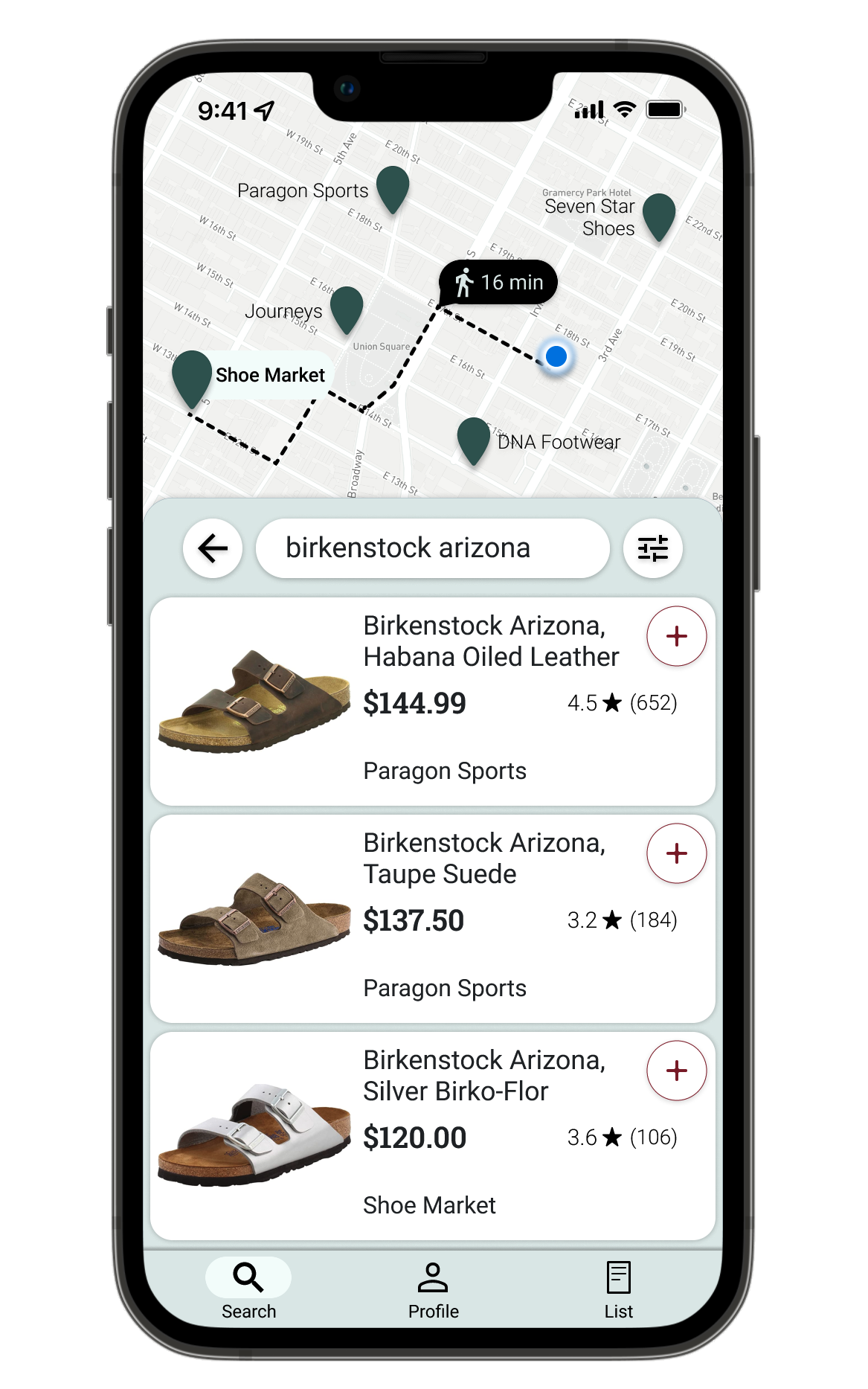
Home / Search
The user flow begins with entering an item to search for or choosing a category to browse.
🙋
Search Results
The user browses items from a variety of stores nearby, holding an item’s visibility button to instantly see the route and travel time to the store carrying the item displayed on the map.
Item Details
The user can read the product description or see more photos before adding to the shopping list. Only the route to the store with this item is shown above.
-
In this app, users browse items from the inventory of many nearby stores together in a single feed before going and shopping in person. Therefore, the locations of the stores that carry the items under consideration are an important part of the user's decision-making process. The map displays the information (distance, walking time, etc.) most relevant to a product at each step of the user flow.
The desire to immediately have all the relevant information needed before choosing to make a purchase was a very common theme in interviews. I wanted the user to be as informed as possible every step of the way, while still maintaining a seamless browsing experience comparable to that of browsing inventory from a single entity like Amazon or Target in their respective apps.
Testing – Usability Study Round 1
I added a filter/sort option to the right of the search field.
Shopping List
The user views or edits items in their shopping list and eventually checks them off while shopping at the stores in person.
I tested my prototype with 5 usability study participants and created an affinity diagram to help synthesize their pain points and other feedback. Below are three of the issues that I saw frequently come up for participants.
1
Users were confused by the button icons and didn’t think they represented their functions well.
60% of users
What symbol could represent a button that you long press in order to view a route?
On this iteration, I created one using Google’s Material Symbol for layers and blended it with a turning symbol to indicate directions.
For the add-to-list and shopping list buttons, I tried to indicate a list with horizontal lines, while still retaining the shopping cart in the shopping list button to show what type of list it is.
Users wanted different options for sorting search results.
60% of users
I then worked to address these issues as I added fidelity to the designs.
High Fidelity Prototypes
Other Screens in Hi-Fidelity
-
In the interviews I conducted as part of my initial research, participants strongly valued supporting small businesses owned and run by members of their local community. Supporting the diversity of stores they see and walk by each day was a motivating factor for shopping locally.
In this round of designs, I chose a large color palette for the store pins on each map as a way of representing the uniqueness of each small business in a positive, somewhat celebratory way.
-
As I created these mockups, I kept in mind other insights usability study participants had said they'd like to see.
Some wanted the map to be expandable by swiping, so I layered the map in the back, the shopping "panes" in the middle, and the navigation bar in the bottom front, rounding the corners of the panes to give them a swipable look even though I'd add that functionality in the prototype at a later stage.
Participants also recognized that I would need to group the items in the shopping list by store, which I did. This would be needed when a planned shopping trip had multiple stops.
Then it was on to test my high-fidelity prototype on 5 new study participants.
Testing – Usability Study Round 2
1
The store button does not look like a button to users.
60% of users
2
Users want to see item ratings and/or reviews.
60% of users
2
I added a stock indicator to each item near the add to list button.
3
The cart symbol for shopping list mistakenly implies online shopping.
40% of users
Home / Search
Search Results
Item Details
Shopping List
3
Users wanted to see an indication of current stock.
60% of users
After the second usability study, many more insights emerged, which I tracked in an additional affinity diagram. Below are 5 insights that stood out.
4
The color variation in store pins on the map is confusing.
40% of users
High Fidelity Prototypes – 2nd Iteration
Before
Before
Search Within Store
5
Users thought the app used too many colors and looked dated.
40% of users
Below is a comparison of each screen before the second usability study and the changes I made after it, along with some of the data from the study that supported the changes.
After
“The colors of the app do not scream high-end or sophisticated.”
After
Pin Colors
I got rid of the multi-color pins due to user confusion about them.
Navbar Buttons
I gave the buttons in the navigation bar a fresher look with symbols that fill / increase in weight and get a pill-shaped backdrop when in the active state.
Color Palette
I was never happy with the bluish-gray primary color. When study participants agreed, I invested more time in trying new palettes.
I finally landed on "Mint Cream," at least partly because it sounded so delicious.
Before
“The buttons on each item are really big.”
“The cart in the list button makes it seem like online shopping.”
After
After
Shopping List Button
The shopping cart symbol inevitably meant online shopping for users, so I created a new list icon without it.
Item Ratings
Participants in both usability studies brought up ratings for items as a desirable feature, so I added it. For space and at-a-glance reference, the # out of 5 took priority instead of laying out 5 individual star shapes imprecisely filled in.
Displaying Route
Holding the route button was not intuitive to users. To highlight a route to a store with an item, the user can now rest their finger anywhere on the item – something participants thought would work better.
Before
Before
“I wouldn’t have noticed the store button was a button without help.”
Search Within Store Button
The button to search for other items within a store was either confusing or unnoticed for users.
I changed it to a search button with the store name in a connected pill-shaped backdrop to better reflect the button’s function.
Scrolling
Upon a user’s recommendation, I changed the scrolling interaction so that everything within the white pane scrolls, instead of only the description text as in previous iteration.
Adding to List
I made the add-to-list button much more prominent in this screen and added a quantity selector.
After
Search Within Store Functionality
When a user finds an item they're thinking of buying, they can quickly search other items at the same store to try to reduce the number of stores they need to visit.
Simpler Route Colors
In the maps here and elsewhere, I simplified the colors of the app by making the path to store and estimated travel time black.
After – Planning State
Shopping State
Shopping State
I added a sort of "shopping mode" state to the list by adding the ability to swipe the pane up, covering the map. The first state is now for planning or reviewing a shopping trip with the map of the suggested route to the stores. The second state after swiping up is for when the user is in a store and wanting to check items off the list as they shop.
Accessibility Considerations

1
Color contrast throughout the app meets Web Content Accessibility Guidelines.
Additionally, anywhere a color indicates a function, accompanying symbols or text do, too.
2
Swiping gestures are not the only way to complete a task.
For example, in the swipable shopping list, a tap will expand the pane, and a button is provided for reversing the action.
3
Animations are timed between 150 and 500 milliseconds.
This follows the World Wide Web Consortium recommendations for accessibility.
Business Impact and Future Development
While it was primarily consumers that I designed Local for, small businesses also certainly stand to benefit. For businesses, the app provides a more viable user experience to compete with the ease of online shopping offered by the big box stores. Below are some thoughts for further developing the app in the future:
Inventory Management for Businesses
I think one of the big hurdles for small businesses using Local would be inventory management. How can a small business keep inventory (products offered, but also quantity of stock)
current, so that users could have confidence in the information they were seeing? An app with unreliable information wouldn’t be useful to anyone.
In the future, I’d love to design an app for utilizing AI-driven visual search tools like Google Lens that business owners could use to quickly scan shelves periodically throughout the day to generate real-time stock #’s and pricing to be loaded into the backend of Local for consumers. The capability for scanning bar codes has been around for ages, and I think the ability for an app that uses Google Lens-type tech to additionally determine things like the number of items on a shelf and whether a sale sticker or sale sign is present is certainly attainable today.
Lists with Location-Based Suggestions
One potential feature that came up in a user interview had to do with location-based notifications. The idea is that a user could add items they need to an additional shopping list of items they don’t need urgently. Then when the app determines the user is a short distance from a store carrying the item, they are reminded to pick it up, if convenient. Users could also choose to be notified specifically when an item is on sale nearby, if it’s a deal they are holding out for. This could be a great feature for items users need to pick up eventually, but not necessarily on their next shopping trip.